

Learn how to create intuitive interfaces and products
This book will guide you through the characteristics and behavior of UI components and UX/UI best practices.

We made this book as practical as possible
You will have 75+ best practices. Each best practice includes correct and incorrect examples, along with an explanation of why.
Check out one of the best practices for the Tabs component
Tabs component (snippet from the book)
Don’t use tabs when users need to go through content in a specific order
When users need to go through content in a specific order, avoid using tabs, as they don't provide a sense of progression. Instead, use a progress indicator or display content on a scrollable page.

1.
In the multi-step form, tabs are used to split the form into steps. However, tabs don’t provide a sense of progression, so it’s not clear which steps the user has completed and which come next.

1.
Instead of tabs, the multi-step form uses a progress indicator that clearly shows which steps the user has completed and which come next.
Take a look at one of the best practices for typography
Typography (snippet from the book)
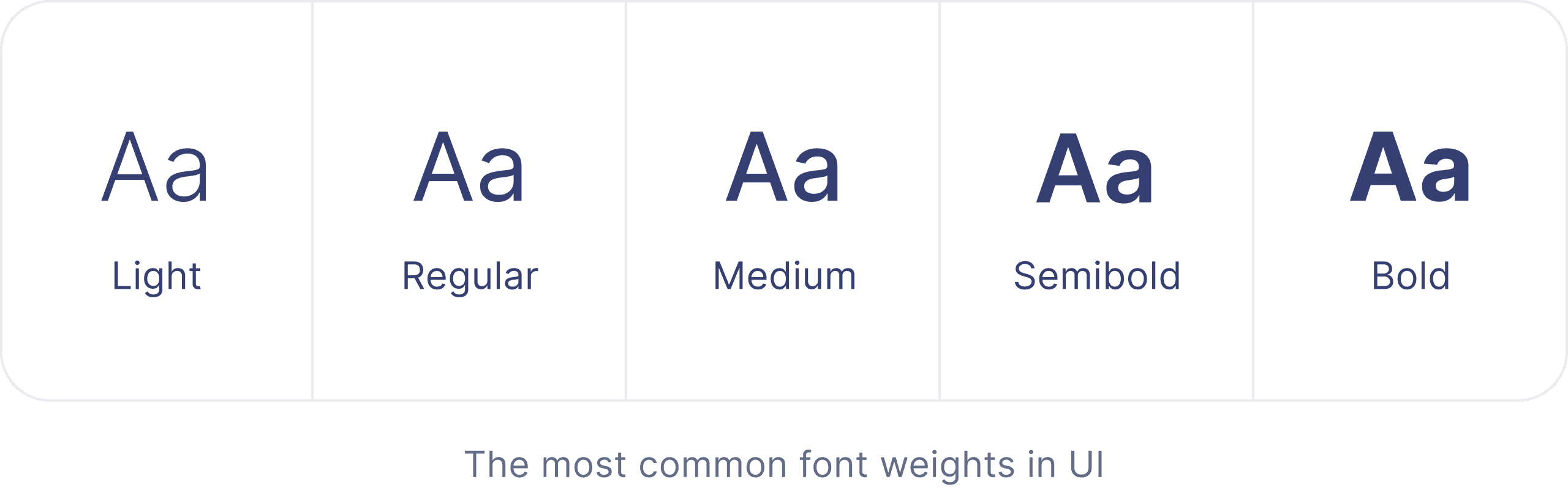
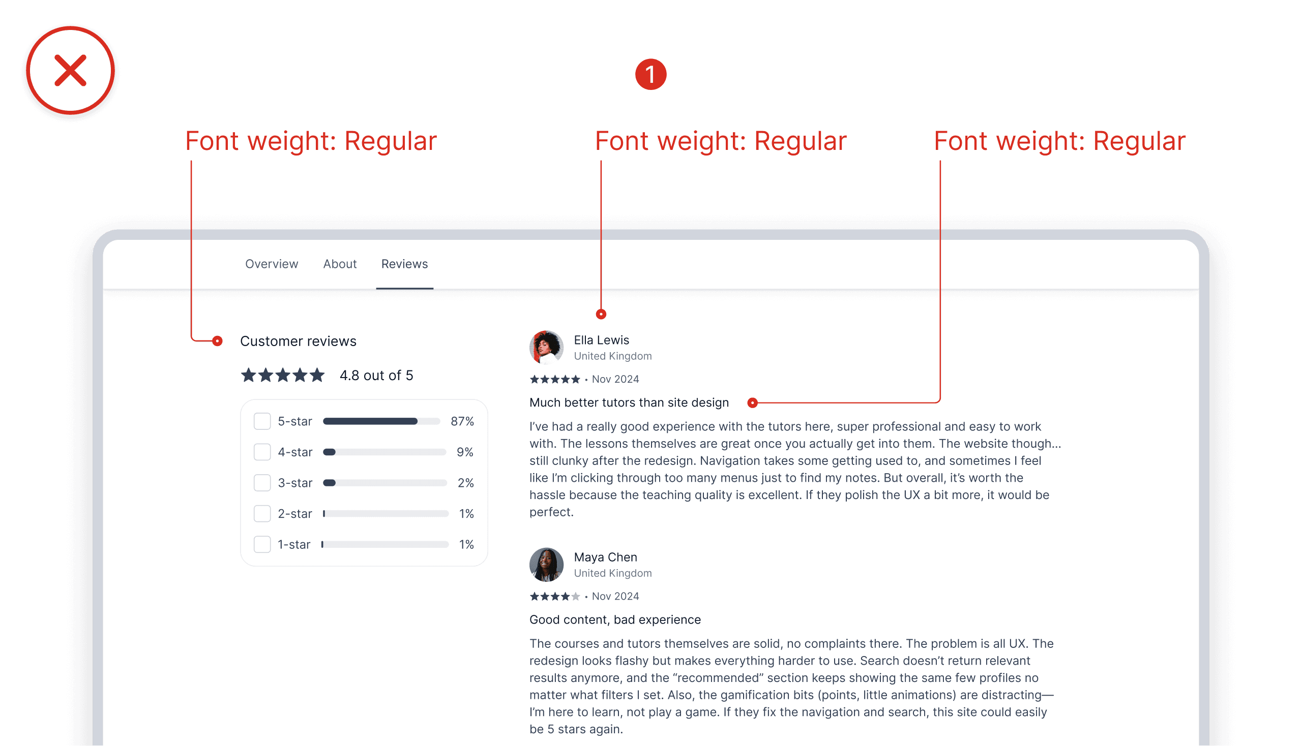
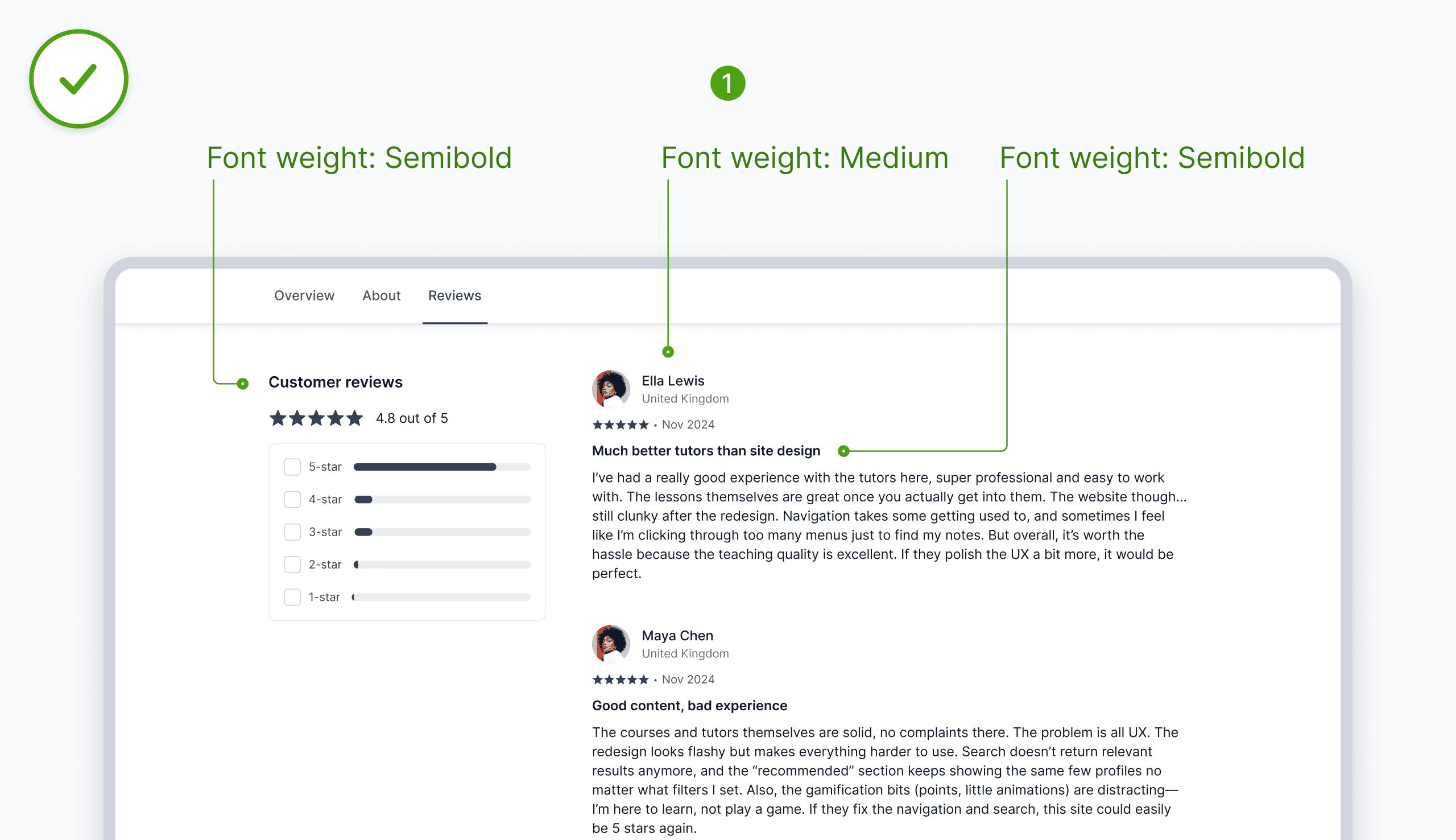
Adjust font weights for visual hierarchy and readability
Font weights help emphasize content and establish visual hierarchy. They are measured on a numeric scale (100 – 900), where 100 is very light and 900 is the boldest weight. Avoid using light weights (Thin, Extra Light, Light) for body text and small captions, as they can be hard to read, especially for people with visual impairments. Use them primarily for large headlines with strong contrast. As for bolder weights (Bold, Extra Bold, Black), remember that they take up more visual space, and overusing them makes a page feel heavy and cluttered. Use them sparingly to emphasize headings, key points, and short impactful statements.


1.
Only one font weight (‘Regular’) is used for all text elements. As a result, the section heading, review titles, and user names are not emphasized, leading to a lack of clear visual hierarchy.


1.
The section heading and review titles are emphasized with the font weight (‘Semibold’), while the user name is emphasized with the (‘Medium’) weight, maintaining a clear visual hierarchy.
We described each UI component in as much detail as possible
You will learn about the characteristics and behavior of each component with a lot of visuals.
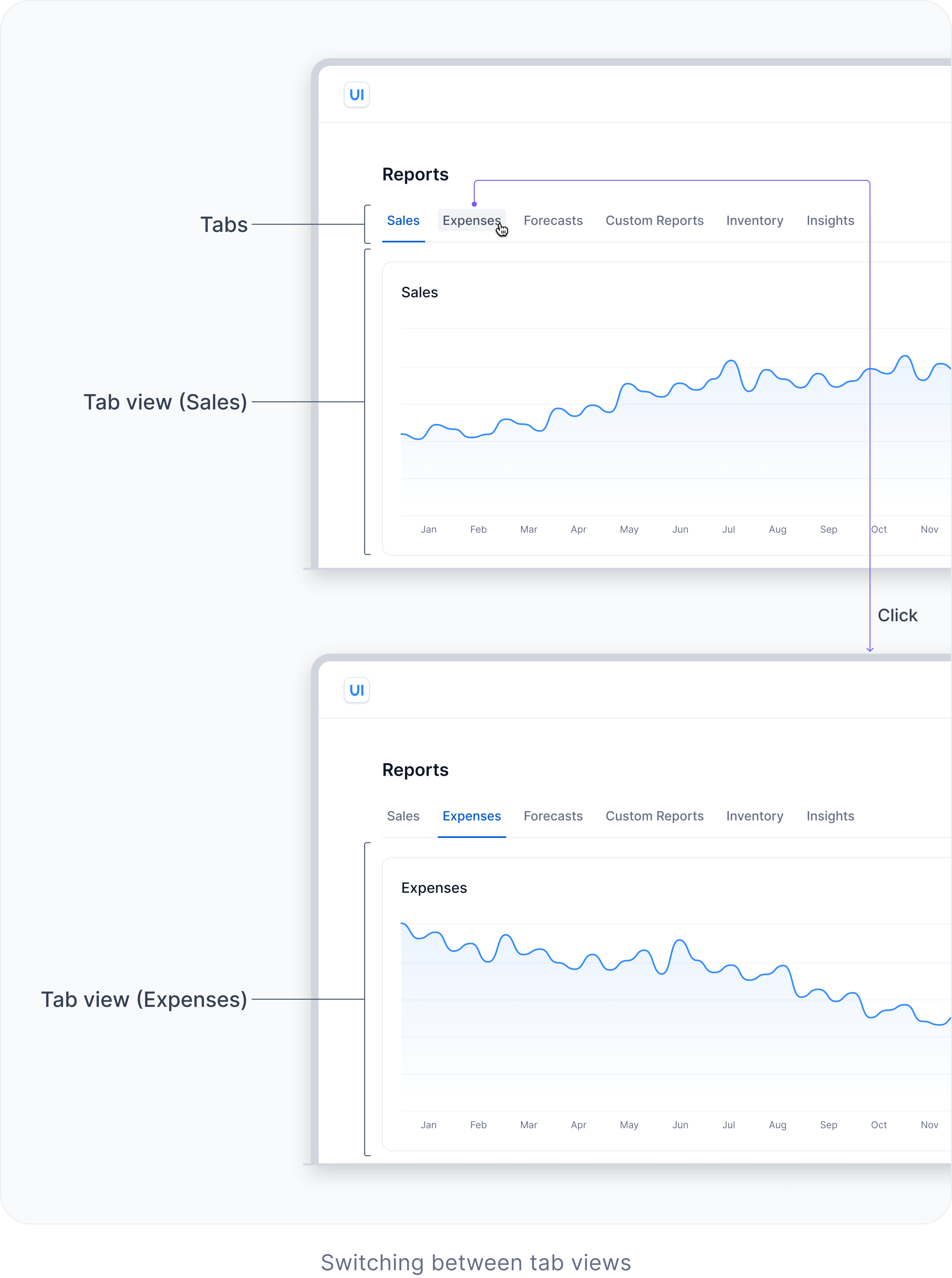
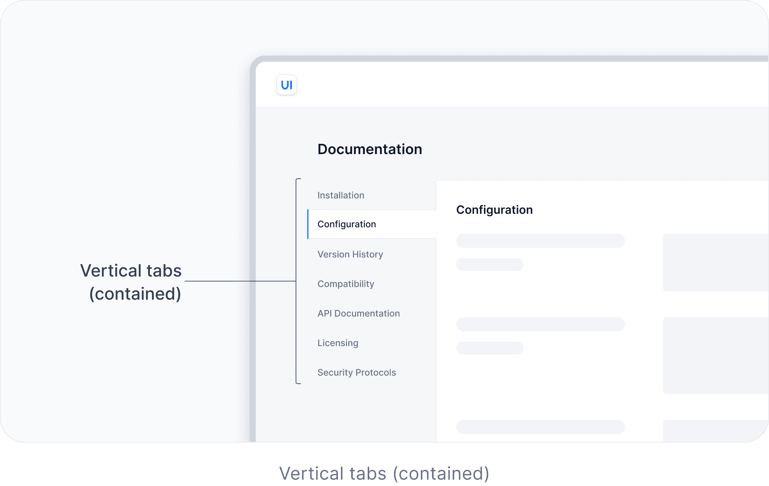
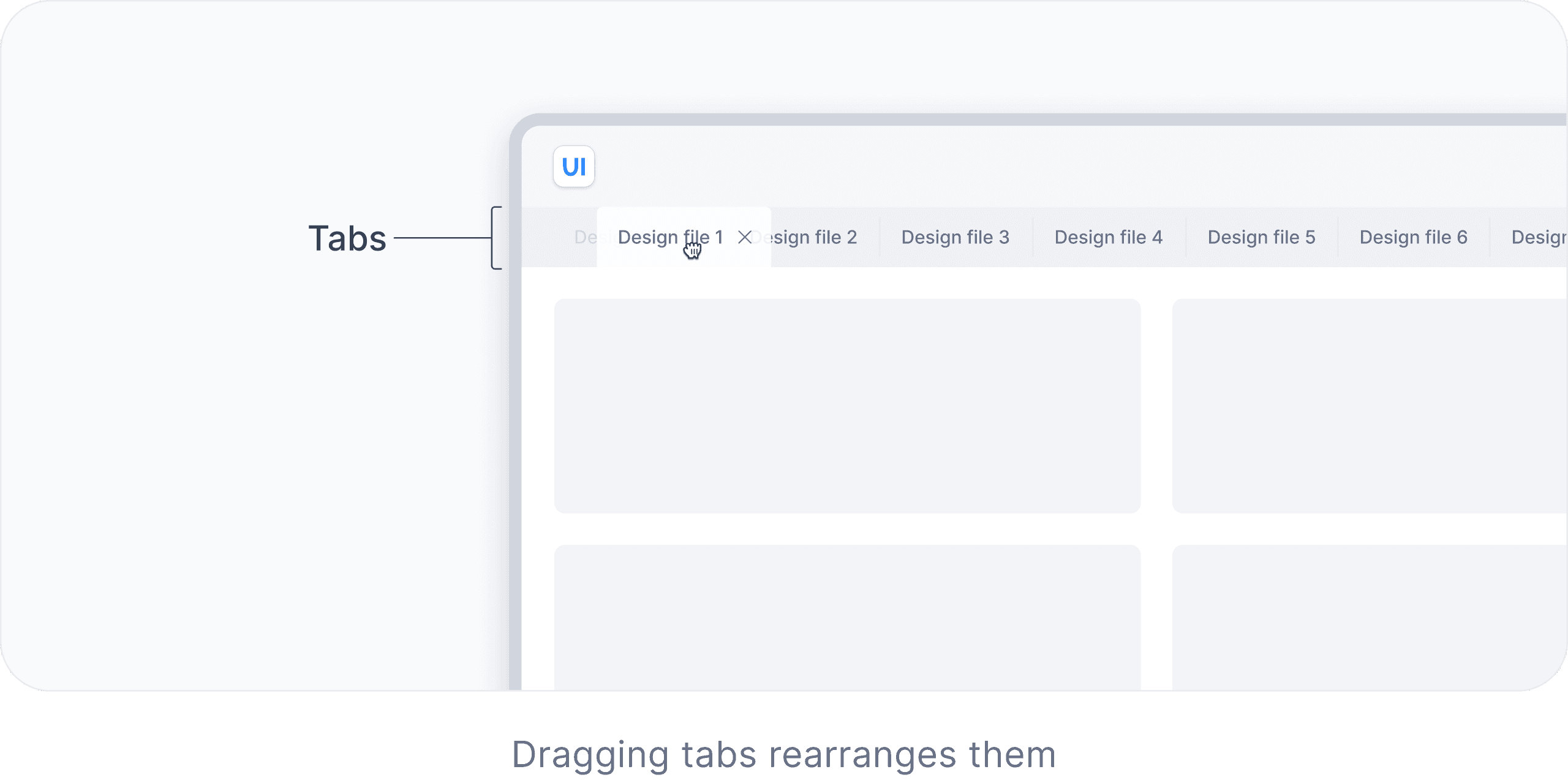
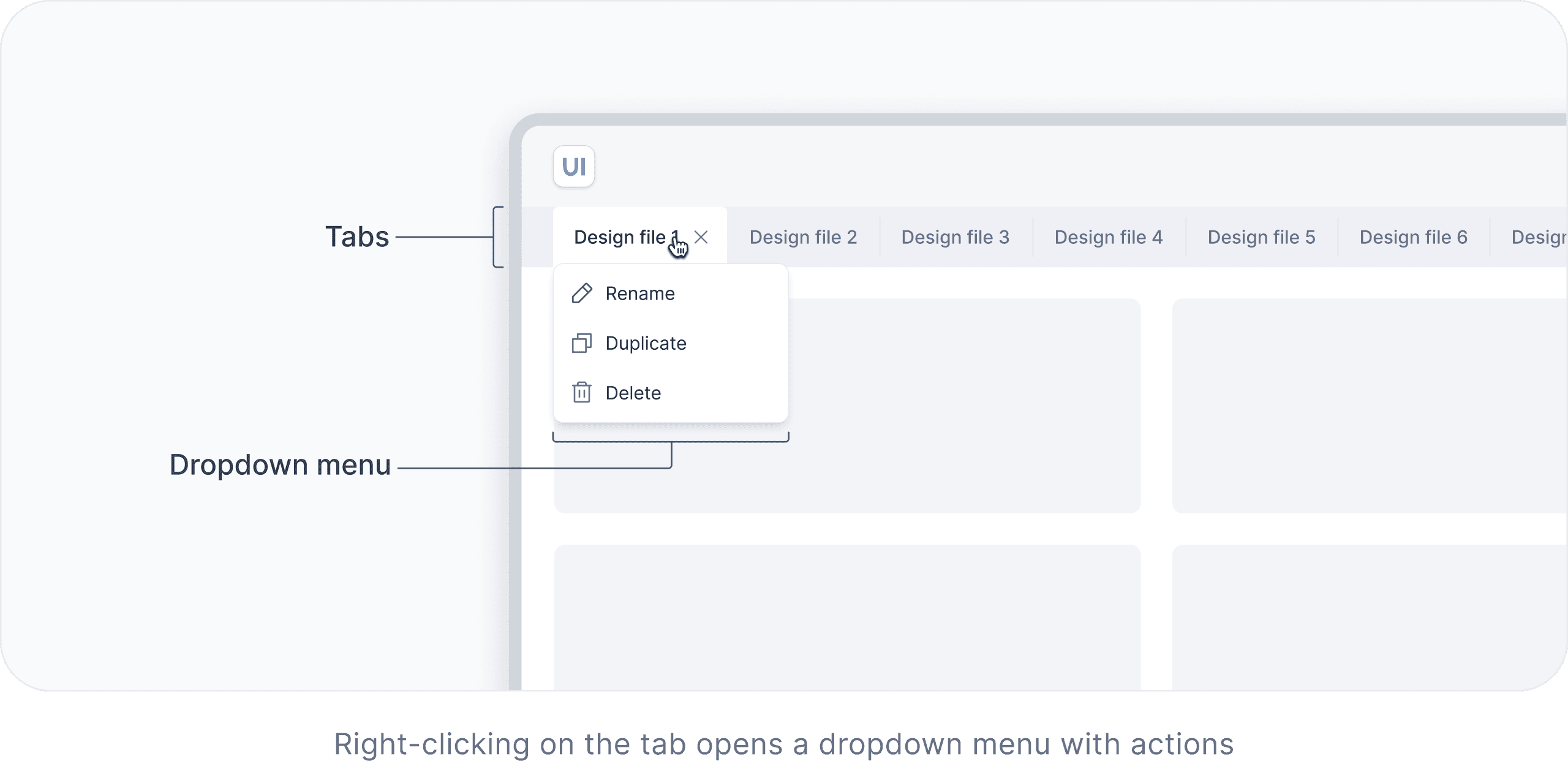
Check out a few pages from the Tabs component
Tabs component (snippet from the book)
Each tab represents a distinct view with its own content (also known as a ‘tab panel’). Clicking or tapping on a tab activates it and shows the associated view. By default, the first tab is active.

Tabs can also be designed as contained. This style helps visually emphasize the tab view through the use of a distinct container or border. For example, in complex interfaces, contained tabs help users keep their focus when switching between different views.


In complex interfaces, such as web browsers or software, tabs can be used to organize and manage multiple documents or views within the same window. Tabs can be dismissible, draggable, and scrollable. Each tab can open a dropdown menu with actions. Additionally, new tabs can be added.


And, of course, we cover both mobile and desktop
You will learn how to adapt components to mobile.
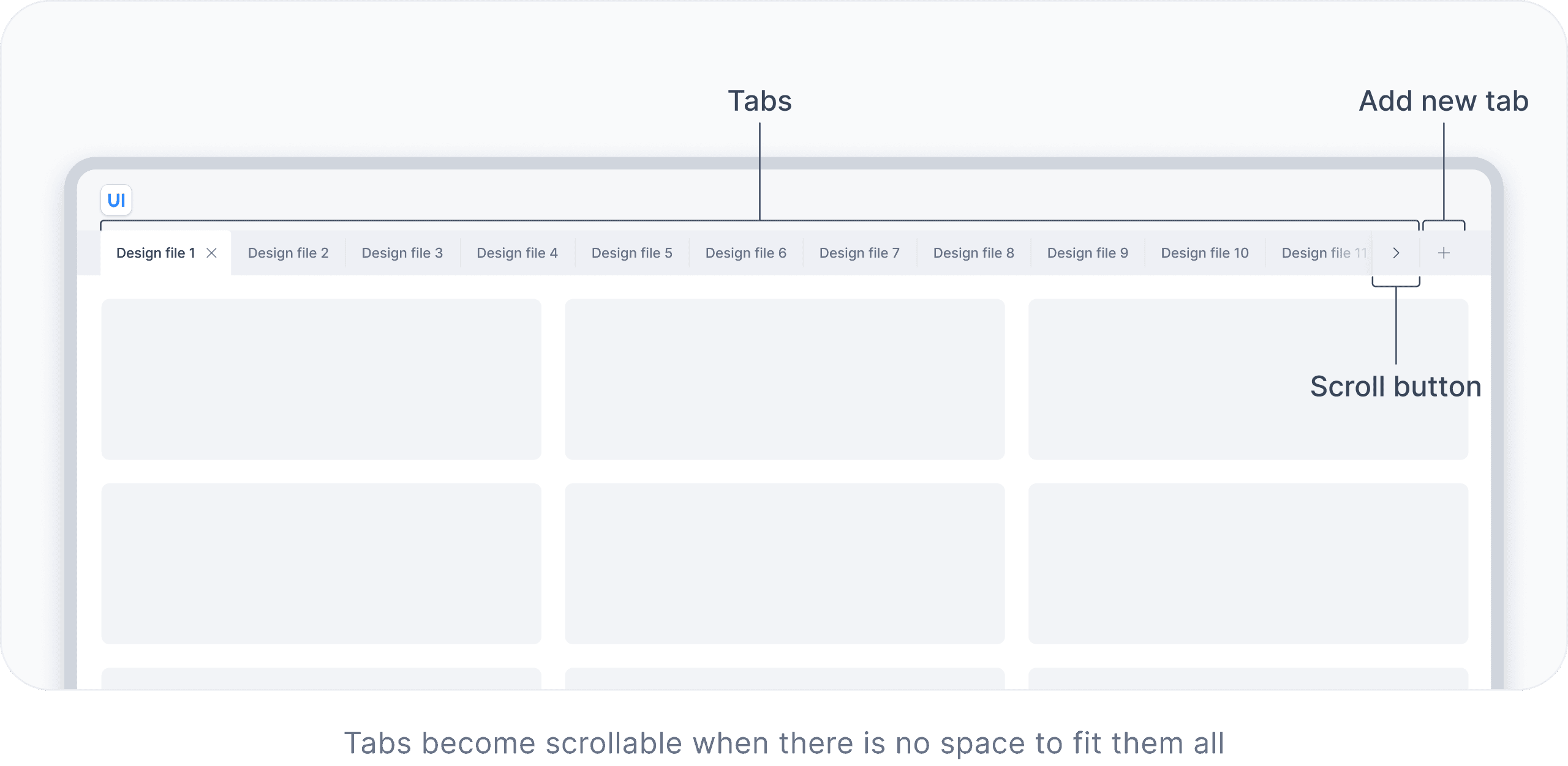
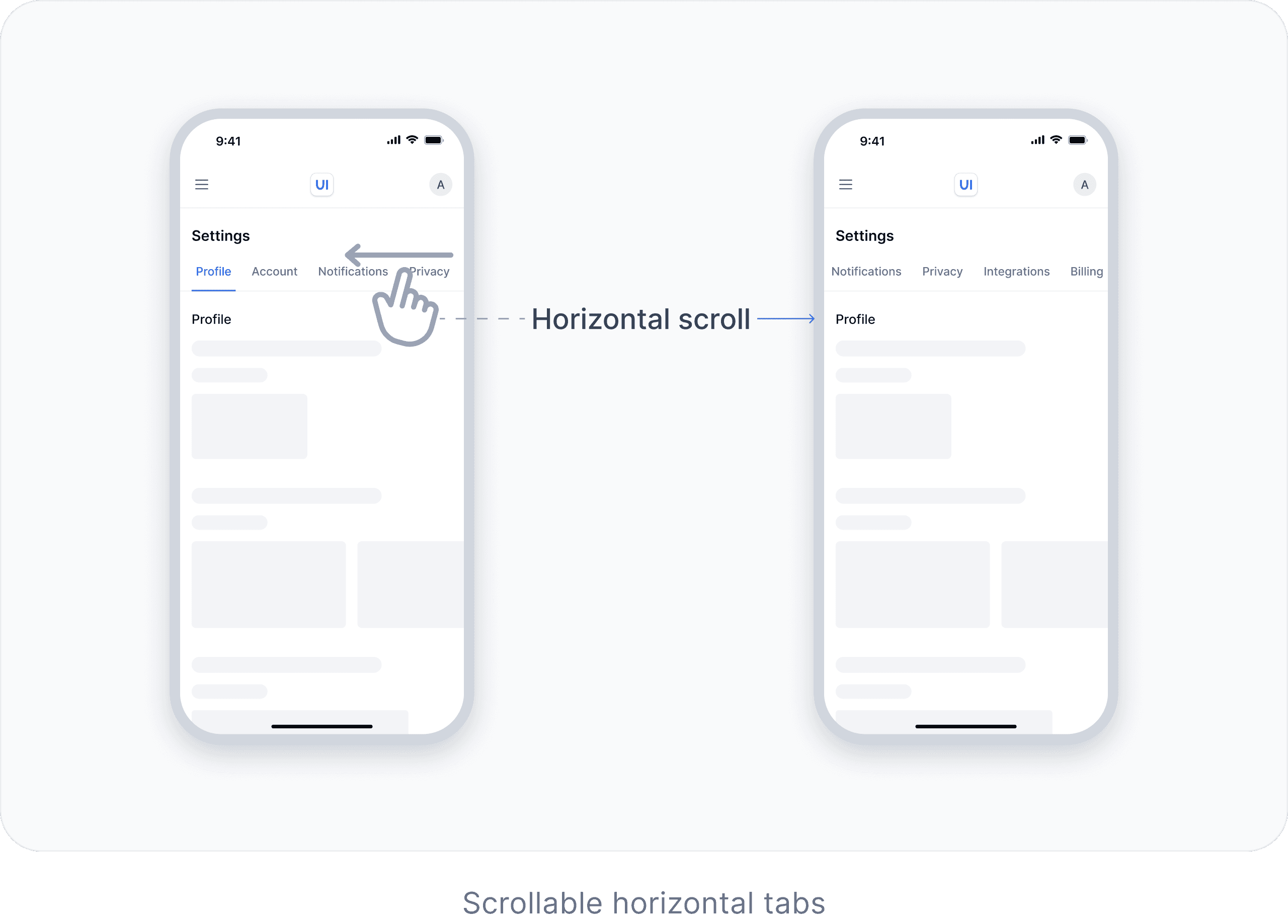
Check out a couple of ways to adapt Tabs for mobile
Tabs component (snippet from the book)
On mobile, when horizontal tabs cannot fit on the screen, they can become scrollable or some of the tabs can be hidden in a dropdown menu.


How is this book structured?
The book has two main sections: General UX/UI Best Practices and UI Components.
Section 1
General UX/UI Best Practices
We cover best practices for:
Typography
Colors
Spacing
Borders and shadows
Interaction
Section 2
UI Components
For each component, we cover:
Characteristics & behavior
Common building blocks
Examples
Best practices
Who is this book for?
This book is useful for everyone, from absolute beginners to experts.

Designers
This book will improve your knowledge about UX/UI and guide you in every project.

Developers
This book will help you align more closely with designers, build user interfaces more efficiently by understanding the behavior and structure of UI components, and improve your overall design skills.

Product Managers
UX/UI knowledge from this book will help you stay on the same page with designers and developers, make better product decisions, and improve success metrics.

Founders
The design of the interface influences how users perceive your product. That’s why we recommend this book to founders to help them create better products with UX/UI best practices in mind.

Marketing Specialists
You can apply UX/UI best practices from this book to improve success metrics and collaborate more effectively with product managers and designers.
So, how much does it cost?

You will have access to 390 pages covering general UX/UI best practices and 11 core components. You will also have access to the other 10+ components once they are ready.
About authors
We are Anastasia and Vlad. We have been in the digital world for about 12 years. In 2019, we started creating educational content for designers. In 2022, we created a product design roadmap that guided hundreds of thousands of people. Encouraged by the positive feedback from the community, we decided to write this book.